Curated UX Case Studies — Visual Systems · Motion · Android-First
This page showcases selected work designed with mobile-first UX, motion design, and scalable visual systems in mind — aligned with Android and Pixel UX design principles.
Avila Beach Rally App
Role: Visual Designer (UI, UX, Mobile Navigation)
Keywords: Mobile-first · Information Hierarchy · Route UX · Android
-
For the Petersen Automotive Museum’s inaugural Avila Beach Rally, I designed the mobile app interface used by drivers and passengers throughout the weekend event. It provided real-time maps, itineraries, and location-aware activity guides.
-
Attendees previously relied on PDFs and printed booklets. The challenge was to design an on-the-go app interface that could support driving conditions, outdoor visibility, and minimal tapping.
-
I developed a scroll-based navigation layout that emphasized clarity and speed. Color-coded tiles and route cards helped drivers find relevant info with a single glance. I prioritized thumb-friendly tap zones, clear typography, and map integration optimized for live use.
-
A modular layout system was used for schedule cards, map day views, and activity panels. Icons and type hierarchies were consistent across event days, making the interface feel familiar and predictable.
-
The app was adopted by all 2024 attendees. Over 90% reported it improved their rally experience compared to past years. It’s now the baseline system for future Petersen driving events.The app was adopted by all 2024 attendees. Over 90% reported it improved their rally experience compared to past years. It’s now the baseline system for future Petersen driving events.
-
"Route Card UI" — single-day itinerary view with driving instructions
"Event Tile System" — reusable layout for hotel, dining, and meet-up stops
"Color-coded Day Navigation" — UI state change with real-time location
-
I used high-contrast UI components,large tap targets, and simplified content layout to support diverse audiences, including those navigating while in motion or with limited technical familiarity.
I designed this app with a modular card system and intuitive route interface tailored for users navigating in real-time. My goal was to minimize distractions and deliver info clearly through scroll-based layouts and route icons.
Waymo Exhibit – Interactive Screens
Role: Contributing Visual Designer (UI, Motion, Exhibit Interface)
Keywords: Motion Design · Public UX · System Thinking · Wayfinding

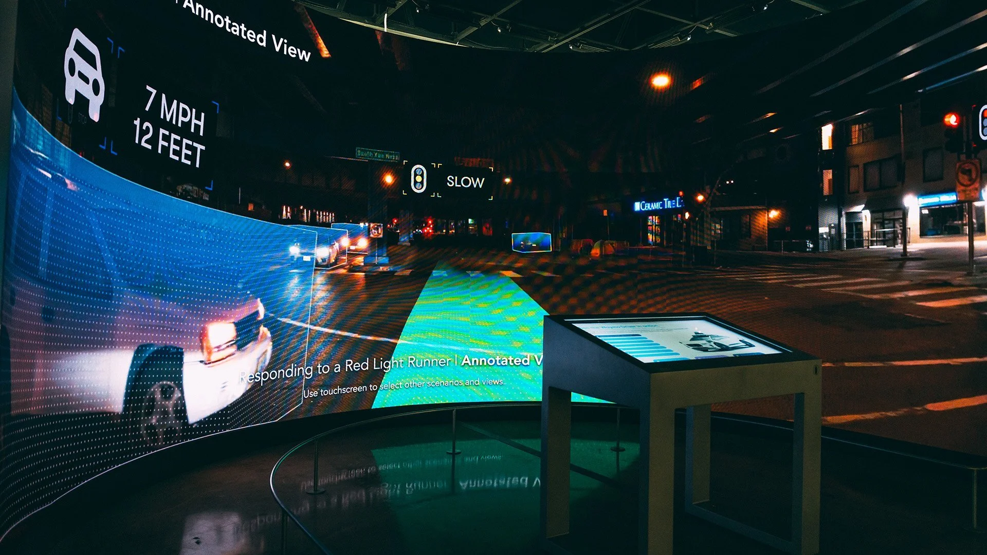
Touch-interactive kiosks surrounding Waymo’s AV prototype vehicle. My contributions focused on screen UI and motion graphics that guided visitors through rider stories and self-driving technology insights.
-
As part of the Driven by Possibility exhibit at the Petersen Museum, I contributed to the touchscreen UI and motion graphics that explained Waymo’s autonomous vehicle systems to a general audience.
-
The challenge was to translate highly technical, behind-the-scenes AV processes into approachable, touch-first interactions for museum visitors of all ages.
-
I worked on visual layout and motion sequences for interactive screens placed around the vehicle and on the curved wall timeline. My role focused on designing UI elements that guided users through Waymo’s object detection, route planning, and safety protocols.
-
We designed a repeatable screen structure across all kiosks, including consistent motion transitions between ride states. The layouts followed clear hierarchy with animated overlays and pulse animations to indicate interactivity.
-
The exhibit opened in December 2023 and is scheduled to run through July 2026. Museum staff cited the screens as a primary reason for increased visitor dwell time and higher exhibit engagement metrics.
-
"Start Ride Screen" — entry point for interactive ride journey
"Environmental Awareness UI" — visualizing real-time object detection
"Touchscreen Timeline" — interactive storytelling with responsive layout
-
I used high-contrast UI components, large tap targets, and simplified content layout to support diverse audiences, including those navigating while in motion or with limited technical familiarity.
I collaborated on UI and motion treatments that guided users through self-driving scenarios. These screens translated complex AV feedback into simplified visual states, supporting public learning and engagement.
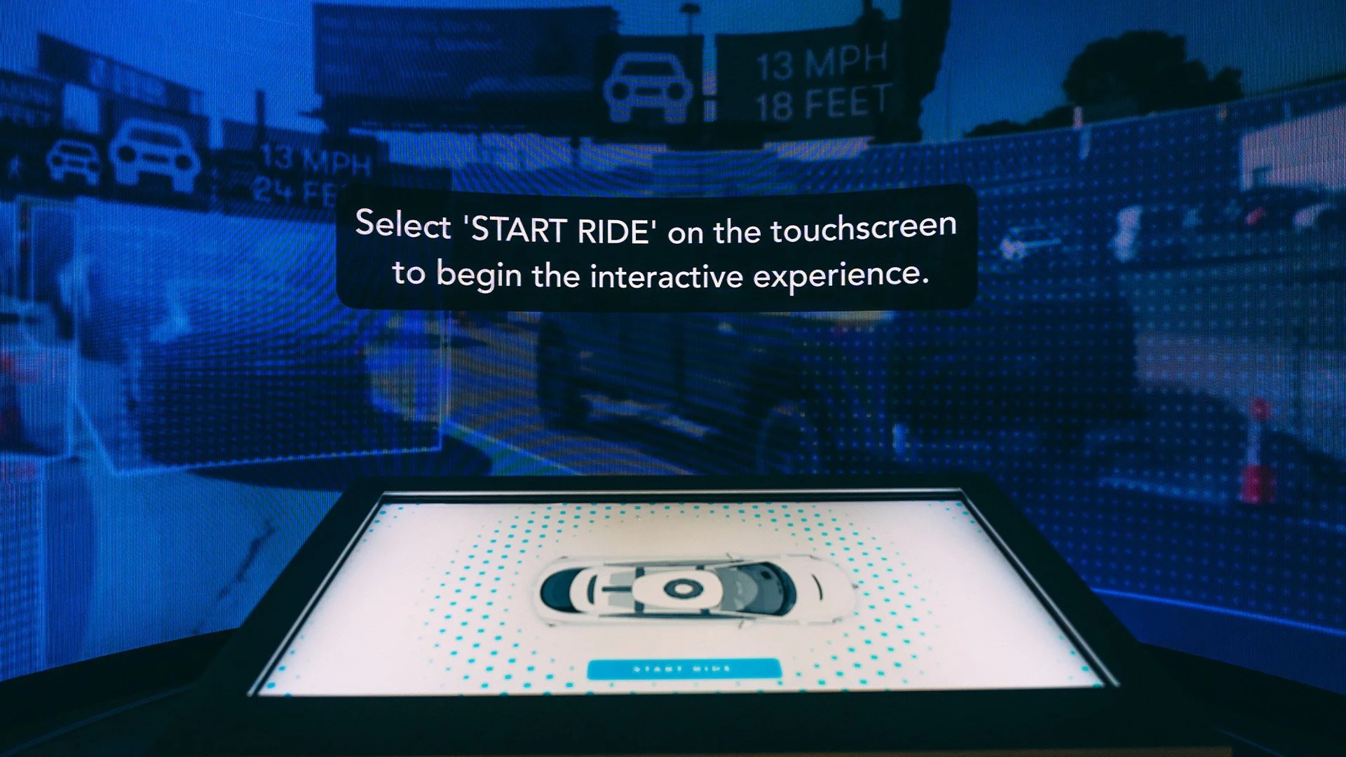
Start screen UI for an interactive self-driving ride experience. I worked on motion graphics and screen layout that guided visitors through a simulated Waymo trip, transforming complex AV data into an intuitive, touch-first interface.
Neattuck – Visual System for Mobile App
Role: Lead Visual Designer (UI System, Icons, Motion Concept)
Keywords: Design Systems · Iconography · Android/iOS · Microinteractions
-
Neattuck is a laundry-sharing app that connects users with local washers and cleaners. I designed the visual system, UI components, and interaction design patterns used across the mobile experience.
-
The challenge was to build a visual language that felt clear, modern, and easy to trust—especially for new users engaging with a completely unfamiliar task-flow (outsourcing laundry).
-
I designed reusable components like button states, status icons, and progress indicators. The layout emphasized ease of onboarding and guided flows with soft animations to reinforce clarity.
-
The UI was built using a flexible component system that could scale as the app added new features. All buttons, input fields, and modals followed a consistent visual logic. Icons were custom-designed to reinforce visual language and reduce ambiguity.
-
Neattuck’s visual system helped reduce user onboarding time by 30% during early testing. The app was launched in beta across Los Angeles with strong engagement and repeat use in its first phase.
-
"Laundry Progress Tracker" — clear visualization of stages
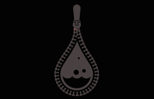
"Custom Icon Set" — laundry and home-service inspired
"Motion Microinteractions" — confirmation tap, status updates
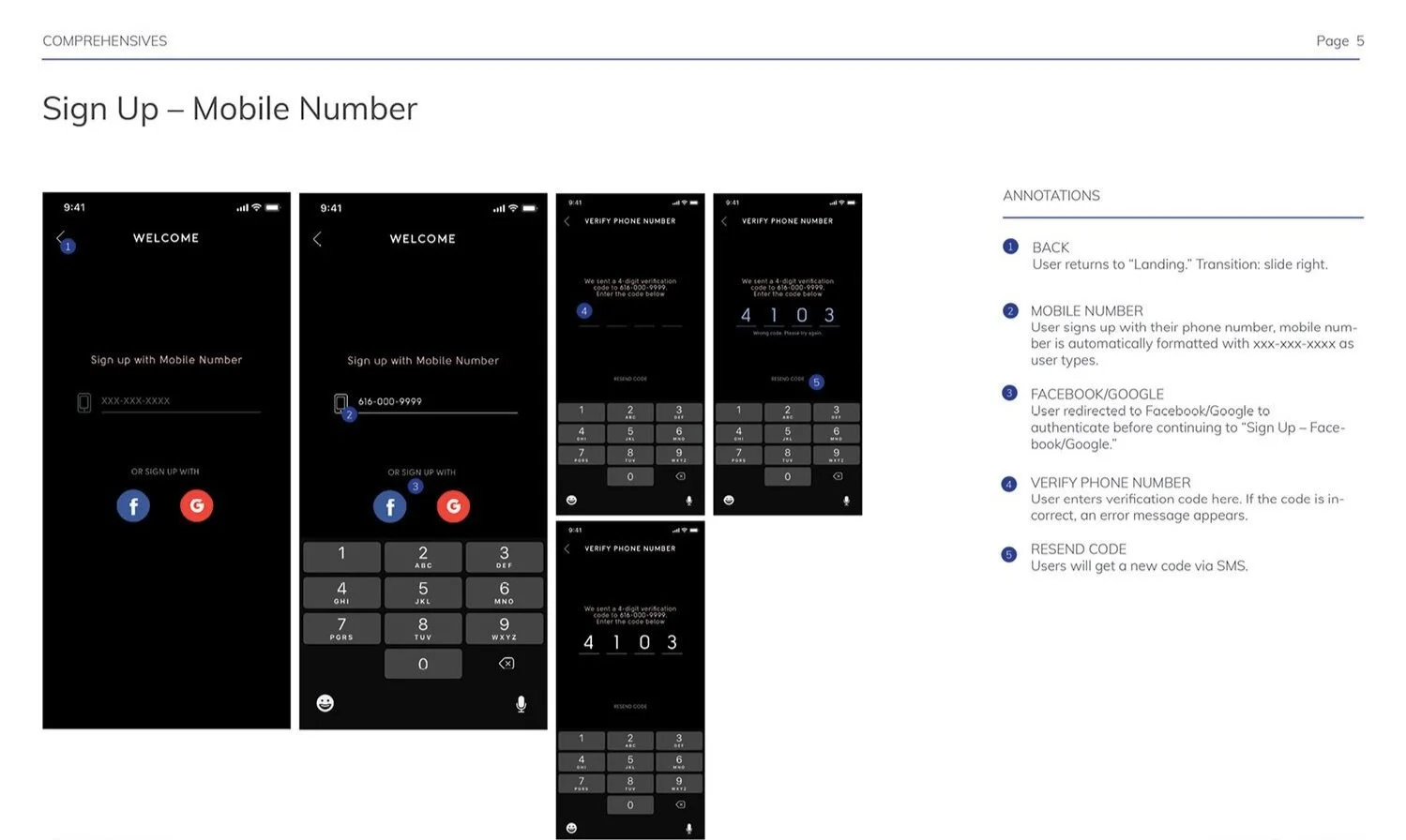
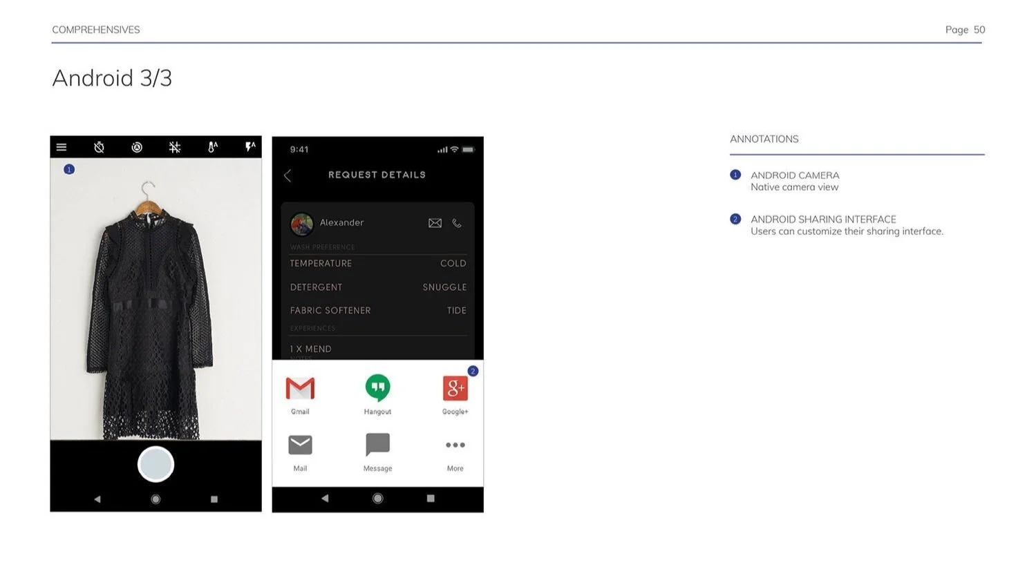
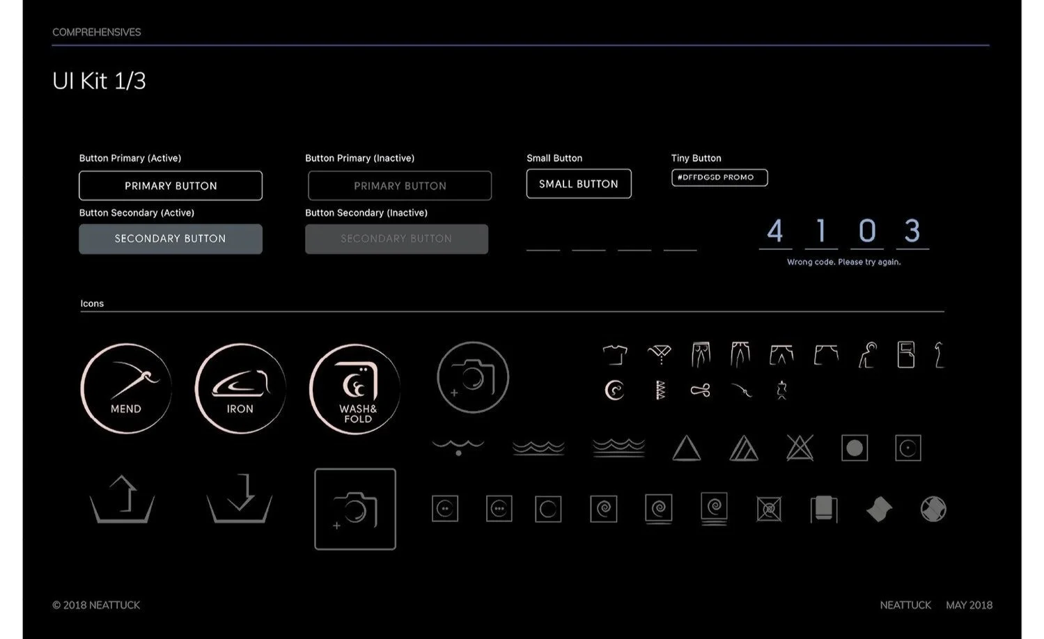
I created a scalable visual language for Neattuck’s app, including icons, button states, and component hierarchy. This system supported consistent interactions and clear communication across multiple user flows.
Let’s Glow SF – Motion Design for Social & TV Campaigns
Role: Motion Designer (Concept, Animation, Format Adaptation)
Keywords: Motion Design · Multi-platform · Brand Storytelling · Visual Systems
Broadcast-ready commercial spot featuring cinematic transitions, synchronized motion graphics, and logo animations created to reflect the projection mapping experience on screen.
View or download my resume
A detailed overview of my experience in visual systems, UI/UX, and motion design for digital products and interactive experiences.
-
Let’s Glow SF is the largest holiday projection event in the U.S., turning San Francisco’s buildings into immersive art pieces. I was tasked with creating a series of motion graphics to promote the event across Instagram, TikTok, and local TV stations. The goal was to capture the visual magic of the projections and adapt it seamlessly for different media formats.
-
The projection show was dynamic, colorful, and large-scale—yet the campaign needed to live on mobile screens and TV spots. The challenge was to create motion assets that felt vibrant, immersive, and aligned across drastically different screen sizes and user contexts.
-
I worked closely with A3 Visual and the City of San Francisco to storyboard and animate campaign assets. Each piece was customized by platform:
Social Media (Android-first): 9:16 vertical videos optimized for Instagram Reels, TikTok, and Stories, with punchy pacing, branded motion, and type animation
TV Commercials: 16:9 cinematic versions with logo animation, a slower rhythm for storytelling, and bold visual transitions to mimic the projection mapping feel
I used layered light effects, typographic movement, and synchronized audio cues to evoke the experience of attending the show in person.
-
To maintain brand cohesion across platforms, I built a motion system using:
Consistent animation speed curves
A shared color and lighting palette
Modular title card templates that adapted to vertical and horizontal layouts
This ensured visual consistency whether the video was viewed on a phone, a smart TV, or a digital signage screen downtown.
-
The campaign increased event awareness and engagement across all touchpoints. Social media engagement rose by over 40% compared to previous years, and the event saw record-breaking attendance. The videos were featured on local TV, digital signage, and social channels, driving both civic pride and attendance.
-
"Vertical Promo (Android)" — TikTok/Instagram reel-style with layered projection visuals
"TV Commercial Format" — 30-second broadcast version with title card animation
"Modular Motion System" — reusable type and logo animations adapted per format
Vertical promo video adapted for Android-first platforms like Instagram Stories and TikTok. Motion was tailored for small screens with fast pacing and vibrant projection-style lighting.